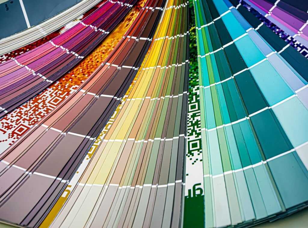
Choosing colors for your home can feel like a nightmare. You want everything to match, but it’s easy to end up with a chaotic mess or just freeze up. Trust me, I’ve been there.
This article aims to clear the confusion with a full color palette guide. I’ll break down color selection in a way that makes sense for your interior design projects.
I’ve studied color psychology and design principles, and I’ve seen firsthand how the right colors can completely transform a space. You deserve actionable advice that you can apply in your own home.
By the end, you’ll feel empowered to pick colors that look good but also reflect your personal style. Let’s dive into how color can boost your living environment and create a space you love coming home to. Are you ready to open up the potential of your home?
The Hidden Magic of Colors: Creating the Perfect Palette
When I think of a color palette guide, I consider it a secret weapon in interior design. It’s not just a random set of colors thrown together. It’s a strategic selection that shapes the entire mood of a space.
You know how certain movie scenes hit you with a specific feeling? That’s what colors do to your space.
Colors speak to us on a psychological level. A room painted in cool blues can calm you down after a hectic day. In contrast, lively reds might energize you more than your morning coffee.
It’s wild how those visual cues can change your entire vibe.
Choosing a cohesive color scheme isn’t just about avoiding visual chaos (although that’s important). It’s about creating harmony. Imagine walking into a space where each element sings the same tune.
That’s the power of deliberate color choice.
On the flip side, random color mixes can leave your space feeling like a bad 80s sitcom set. No one wants that. So take control (pick) colors that connect with your style and offer both beauty and comfort.
In the end, colors are more than just a pretty face. They’re the soul of your space.
Color Theory 101: Cracking the Code
Ever heard of a color wheel? It’s the secret weapon in your color palette guide. At its core, it’s a tool for understanding the relationships between colors.
You’ve got primary, secondary, and tertiary colors all laid out in a neat circle. And the way these colors mix and mingle can change everything.
Warm colors like reds and yellows can make a room feel cozy. It’s like wrapping yourself in a soft, warm blanket. On the flip side, cool colors like blues and greens bring tranquility.
Think of a serene lake on a breezy day. So how do these affect your mood? Huge.
They alter how a space feels (temperature-wise) and emotionally.
Let’s talk about the big three: hue, saturation, and value. Hue is just the pure color itself. Saturation is its intensity (turn it up to go bold).
Value is about lightness or darkness. Mixing these gives you subtle palettes, which can be game changers in your design.
Curious about how to blend these ideas into your home? Check out mastering transitional style interiors. It’s all about balancing the old with the new, just like a good color mix.
Pro tip: understanding color temperature can really raise your space.
Decode the Classics: Color Schemes for Timeless Interiors
Let’s talk color schemes. You know they’re the backbone of any sophisticated interior. First, we have monochromatic schemes.
They’re all about variations in tint, tone, and shade of a single hue. Think of the serenity in a minimalist bedroom. It’s like a blank canvas that whispers elegance.
It’s a calming effect, like a gentle river meandering through a forest.
Then there’s the analogous scheme. Colors sit next to each other on the wheel, creating harmony. Picture a living room that flows naturally.
Want contrast? Look at complementary colors. They’re opposites on the wheel, creating vibrancy.
But use them wisely. Try the 80/20 rule: dominate with one and accent with the other. It keeps things lively without overwhelming.
Feeling bold? Go triadic. Three colors spaced evenly on the wheel for a balanced yet playful vibe.
Perfect for creative rooms or where kids play. It’s like having a mini art studio at home.
Lastly, tetradic (or rectangular and square) schemes. They use four colors for rich, complex palettes. Balance is key.
It crafts sophisticated spaces, weaving multiple hues into a cohesive design. For more on creating the perfect scheme, check out this color palette guide.
Crafting Your Perfect Palette: Make Your Space Shine
Creating the perfect color palette for your home isn’t just about picking shades you like. It’s much more subtle. First, think about what you want each room to feel like.

Is your kitchen a lively hub or a calm sanctuary? Your bedroom should be peaceful, right? Consider the vibes.
Lighting plays tricks on color. Natural and artificial lights change how colors look throughout the day. Ever notice how that “calming blue” turns muddy at night?
Choose colors that won’t turn on you under different lights. testing samples comes in handy. Trust me, it’s worth the time.
Now, don’t ignore the elements you can’t change. Your existing furniture and flooring set the tone (and not just in your living room). Work with them, not against them.
This is where many people slip up (don’t) be that person.
Your personal flair matters. If your closet is full of greens and golds, maybe your walls should be too. Incorporate those personal favorites; they’re telling a story about you.
Inspiration lurks everywhere (like in that art gallery you keep visiting). Collect ideas from nature and travel, and let them shape your home’s story.
This color palette guide is your ticket to a personalized oasis. Use it wisely.
Bring Colors to Life: Master the 60-30-10 Rule
Choosing a color palette can be a headache. But once you’ve got it, how do you make it work in your home? The 60-30-10 Rule is your secret weapon.
This rule isn’t just some designer jargon. It’s a simple percentage game. 60% dominant color, 30% secondary, 10% accent. Think walls for dominance, larger furniture for secondary, and pillows or art for pops of accent color.
Neutrals like grays and beiges aren’t boring (they’re) the canvas. They let bold colors shine. Want your home to achieve Scandinavian calm home?
Neutrals are key. They set a calming stage for any palette.
Textures and patterns aren’t just for fashionistas. They add depth and interest when your palette might seem flat. Try velvet throws, a rug with a geometric print, or metallic finishes.
These add layers without clutter.
And here’s a pro tip: always test paint swatches under different lighting. Daylight reveals what artificial light hides. It’s a simple step but dodges costly mistakes.
Trust me, I’ve learned that the hard way. Get it right, and your color palette guide isn’t just theory. It’s livable beauty.
Your Home, Your Colors
You now have a solid color palette guide to get through the color chaos.
Choosing colors for your home doesn’t have to feel overwhelming.
With the principles and strategies I shared, you’re equipped to make confident design choices.
So why wait?
Get out there and start experimenting with colors that speak to you.
Transform your space into a cohesive sanctuary that truly reflects your style.
Take the leap. Your home deserves it.
Dive in, apply what you’ve learned, and enjoy the process of creating a lively environment.
You’ve got this!